Wednesday 19 October 2016

Analysis of Music Magazines


Analysis of Music Magazines


The Rolling Stones magazine depicts the rapper, Eminem holding a jukebox on his left shoulder, with his right hand making a gun symbol towards the camera.  The jukebox represents the older generation of music from which he gained his fame, as opposed to the present era’s version. In addition, the Rolling stones masthead is partially covered by the artist, which leads us to believe that those purchasing the magazine must have previous knowledge of it, because they must fill in the covered title. The audience must therefore consist of ages ranging from 20-60. The gender the magazine is targeted at is male, as illustrated by the indication of violence, rap genre, and aggressive language like “war machine” which are all stereotypes of male interests.

The colour scheme is red and black, the house style for the Rolling Stone franchise. The black bold font implies an attractive simplicity, a straightforward approach to the topics surrounding the music industry. The red is present because of the colours association with the magazine logo (house style), but also because its particular shade, I believe, is linked to previous times when the music industry was just beginning. This links back to the idea of the target audience being of the older variety, since they can appreciate the nostalgia of the consistency.

There are two fonts used, one of which is the magazines traditional masthead “Royal Acidbath”. This further enforces the idea of consistency in the magazine, and the link between them. It is a masculine, elegant font with light red inside, white outline and a shadow. This implies high class status, and a somewhat nostalgic feeling.  The bold font used is simple “Arial black” which is simplistic, and therefore outlines the magazines approach as direct approach. It is all in upper case, which makes connotes power, strength and force. These are all attributed to the male stereotype.

The layout is a standard “C” shape, which follows conventions. The image is centred, and takes priority over all text bar one, the “hook”. The texts around the image all builds up to this, and therefore makes it seem even more urgent. It has a narrative structure.

The frame includes a medium shot of the rapper, which allows us to see his tattoos inked on his left wrist, as well as the numerous chains on his body. The fact he is completely covered, apart from face and hands, creates an aura of ambiguity around him, and adds an ever greater ominous effect to the hook. This uses the grandiose term “reborn” which links in with the previously stated point.

Eminem is represented in a neutral light, only showing what he has endeavoured to show his whole career. He is shown as strong, as inferred by his posture, determined, scribed by the expression on his face, and threatening depicted by his gun gesture, dog tags, chain and tattoo. The word “reborn” signifies a greater version of him has emerged, which may make the audience of the magazine and him feel a sense of pride, or happiness. Contrary to this, if the reader is not a fan of Marshal, then the implication of violence may intrigue them enough to read more. This is because if this is what he is after a “rebirth” (a great change for good), then people may want to know what his personality was previously.


It is my belief that the target audience is ages 14 to 20. This is because of the colloquial language used “swagger” specifically targets the younger generation. It is unisex, as seen from the neutral colour blue. The scheme is relatively light, and is not heavily weighted towards one particular gender.

The font is the same for every Billboard magazine masthead. This is in order to replicate their house style and link the font to their brand.


Thursday 13 October 2016

Lighting


Lighting

High and Low

High key- The scene produces sharp contrasts of light and dark areas. The scene has a natural aspect to it, in order to replicate the environment of the natural world. The females faces are adequately illuminated so that the audience can see the emotions on their faces.


High key- Makes the scene see more mundane. The fact that the lighting comes off as natural, makes the reference to everyday life. The lighting is natural and more realistic to our eyes. This makes the mood more serene and quiet.


 Low key- suggests danger/ suspense 
CIt is created by using only the key & back lights which in turn produces  sharp contrasts of light and dark areas. It has deep, distinct silhouettes that are formed.
High key- The lighting implies danger/suspense. In addition, the blurred effect makes us see from the perspective of the attacker (dazed/enraged).


Monday 10 October 2016

Textual Analysis: Design Elements

Textual Analysis: Design Elements


1. Explain why designers often stick to the rule of ‘3’  what happens is this convention is challenged?
The rules of 3 is a rule which consists of 3 fundamental beliefs. This is a conventional theme that has been reapeatedly used throughout magazines. It is the standard of a good magazine. It is the conventional means, that has repeatedly worked for many magazines. It is the standard of a good magazine. The formula is followed due to the fact it optimises the most money, from the most people due to it having just enough of everything (colour, font, layout, images, direction).
The very fabric of our existence, would simply cease to be. Time eternal, nothing to live, nothing to witness the eternity of the void. Infinity, infinite. Without the glitches in the universe we dare to call life, there would be no unit of measurement in the everlasting abyss we name the universe. 

Thursday 6 October 2016

Mise en scene

Mise en scene

Settings and props


The scene is from The Big Bang Theory. It is set in Penny's kitchen. The scene is focused on Penny, therefore the peripherials (her items) are all present to draw more attention to Penny. It makes her the centre of attention, and all focus is on her (because she is to be the main subject of the scene). This fits into the comedic genre.

The scene is from Pirates of the Carribean. It is set outside, on Jack's throne. The reason is to demonstrate his power, and his absolute assertion. He is flanked by an armed guard, and human skulls. These further enforce the idea he is the alpha. The macrabe scene fits well into the action/adventure. The characters pose suggests that it is a comedic scene, yet the objects suggest otherwise. This makes the text seem somewhat ironic.


Costume, Hair & Make up & 3. Facial expressions & Body Language


They are wearing common clothes. Their hair and make up are that of their generations normal standards. The blonde has a contemplating look, while the other one has a questioning face.


Wednesday 5 October 2016

Representation and sterotypes

Representation and stereotypes

Slashers

Scream- Friday the 13th- A Nightmare on Elm Street


Usually, in older slasher films, you will find the same characters. A black character (colour interchangeable) who never lives to see the end, the attractive male bursting with masculinity and braveness, and his counterpart; a foolish, attractive female. And her adequate, Jane Doe sidekick. This can be related to Propp's theory of the fundamentals of a movie, being broken down into simpler elements. The connotations of the women find that they are a symbol of sex, tied to the pre WW2 stereotype that women are simpler than men, in the sense that their understanding of the world is limited to what their husband/ father says. The stigma dictates that women are bound to duties of the home, and to reproduce. The Levi- Strauss theory can be applied here, due to the fact that the protagonist and antagonist have no real back stories, the two main characters are either purely good, or completely evil; binary opposites. However, in the time we live in women have evolved to take a more powerful stance. An example includes Buffy, in hit- TV series Buffy the vampire slayer. She demonstrates a women in a strong leading role, and doesn't bow to the conventional damsel-in-distress that we are all too familiar with. She's still an attractive female, just not simple, and constricted to sex appeal. Most of the time.

Monday 3 October 2016

5) Evaluation- Preliminary Magazine


How have you used conventions in your product?
I have implemented a multitude of conventions into the product, one of which is the utilisation of the rule of three. This dictates that the magazine abides by three different colours and no more. By doing this, the magazine is more simplistic and flows better. Additionally, I have used the Z-style layout. This is one of the key layouts used by magazines which makes the product that much more realistic.
The barcode was placed on the magazine as a mark of authenticity, not as a practical measure.


How have your represented your chosen social groups?
The target audience for the magazine is sixth formers and their guardians. Therefore, I have appealed to their attention by including articles that they feature in. The main story is prize giving, which was the largest event the school had to offer them. Finally, I have placed the heathland school logo into the magazine in order to assimilate the magazine with the school.


How would the school distribute this magazine and why?
They would hand the magazine to all sixth formers while they are in form time/lesson. This allows the magazine to reach them, and by extension, their guardians (because they will pass it on to family members).


What have you learnt throughout this task?
I have become adept at using Photoshop, and have learnt magazine conventions. I have also understood the process of creating a magazine and the multiple parties that must be involved. In addition to this, I have learnt how to use Google's search bar more efficiently, to find what I need


Thursday 29 September 2016

Theories that apply to The Dark Knight

The Dark Knight


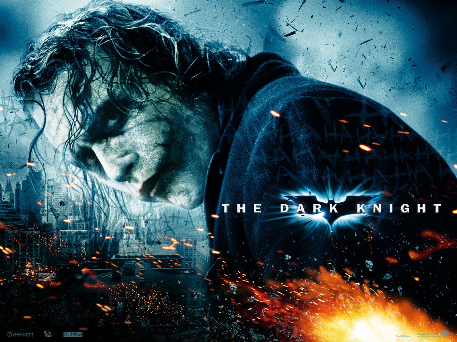
The genre falls under the action category. The sparks and flames depicted in the poster further supports the claim that it is related to action. The background is grey and dark implying that the film is somewhat of the tragedy variety. The bat symbol is the only illustration of light, and can therefore be perceived as a binary opposite ;good vs evil. The flames can be further deciphered as the eternal struggle for power between chaos and order, moral and immoral.
Displayed in this poster have been implemented, and therefore the hypodermic needle theory is applicable. However, I do not think the two step flow theory is correct in this instance as there is no evidence to suggest subliminal messaging. Finally,can be correct in this movie. People may use this video to make up for things in their lives, add excitement or the sense of meaning to their otherwise mediocre, dull lives.


Narrative and audience theories


Hypodermic needle audience link


Media is like a syringe which injects ideas, attitudes and beliefs into the passive audience.

Watching violent shows can make you violent, e.g. Jamie Bulger Killers


Uses and Grats audience theory


We all have different uses for media; information, personal identity, integration and social interaction and entertainment.

BBC news.


Todorov’s narrative theory


It was his belief that all films followed the same narrative pattern. They all went through stages called the equilibrium, disequilibrium, acknowledgement, solving before returning to equilibrium.

Die Hard.


Propp’s character theory


Made of basic components

Hero

Villain
Princess/prize
Donor

Dispatcher

(Magical) helper

Prize protector

Example: Scott Pilgrim Vs The World


Levi- Strauss narrative theory


He believed that the movie would be about the struggle for power between binary opposites.

Good vs Bad

Strong vs Evil

Chaos vs Evil


Shrek

Roland Barthes narrative theory


It was the theory that there are many meanings from a single subject. They believed that the media was like a ball of string, and once unravelled, it would release countless possibilities, to be examined from many different angles.


Analysis of movie poster

Movie - The Dark Knight  Joker Wallpaper


The genre falls under the action category. The sparks and flames depicted in the poster further supports the claim that it is related to action. The character "Joker" is grey and dark implying that the film is somewhat of the tragedy variety. The bat symbol is the only illustration of light, and can therefore be perceived as a binary opposite movie (Levi- Strauss theory); good vs evil. The flames can be further deciphered as the eternal struggle for power between chaos and order, moral and immoral, The Joker vs The Batman.
Violence and blood is displayed in this movie have been implemented, and therefore the hypodermic needle theory is applicable. However, I do not think the two step flow theory is correct in this instance as there is no evidence to suggest subliminal messaging. Finally, Uses and Grats theory can be correct in this movie. People may use this video to make up for things in their lives, add excitement or the sense of meaning to their otherwise mediocre, dull lives.


Women in the Media - 1900s - Present

Three waves of Feminism Timeline


First wave:
1830's to 1900's
The political agendas regarding sexual, reproductive and economic matters were made to aware to the public of Britain. The idea was created that women could contribute equal to men or even surpass them.
Second wave:
1960's to 1980's
After World War II, women decided to broaden the debate by focusing on family and workplace rights. The government had perceived that women achieved their goal, due to the fact they gained the vote after World War I. However, they were still received less pay than men in the workplace, and were sometimes mistreated in public areas. Civil issues such as Black, Chicano, Asian-American Civil rights movements were also arising, but they all joined together to fight for gender equality.
Third wave:
1990's to present
 Women are still trying to get complete equality in all aspects of life. Due to the number of varying feminist outlooks, the word "feminist" can be interpreted in different ways.

Intertextuality

Intertextuality

Intertextuality refers to the interdependent ways in which texts stand in relation to one another (as well as to the culture at large) to produce meaning. 
This is a reference by Austin Powers, paying homage to the James Bond franchise. The image depicts Dr. Evil imitating Blofeld, in his signature pose. This generates humour to the otherwise serious spy series.
The audience then learns about new movies and develops a new taste. It introduces the viewers to the James Bond franchise.


This is a scene from The Simpsons, making light of the movie "Silence of the Lambs". The images shows Mr. Burns imitiating Hannibal Lector. It has a comedic effect which makes the audience laugh, which is the primary goal for the show. The show’s tribute to the film also introduces viewers to another genre of video, and may sway them to watch the Silence of the lamb’s movie.


11) Moodboard