
Showing posts with label New. Show all posts
Showing posts with label New. Show all posts
Sunday, 7 May 2017

Proof of construction- Final magazine

The following shots show the previous magazine that was greatly approved upon to bring the final product:


Evaluation
In what ways does your music magazine use, develop or challenge forms and conventions of retail music magazines?
My foundation portfolio was to gain more knowledge on the conventions of magazines and understand the process from planning to final product. My portfolio consists of a school magazine front cover made to cover a significant event that transpired that would appeal to 6th formers. We had to research other school magazines, define conventions and make it appeal to the masses. This task allowed me to train my Photoshop skills and also research abilities. Due to this, I learnt more Photoshop techniques and conventions of a typical magazine which aided me later.
My main task was created with conventions of rap magazines within the rap genre. My magazine is titled ‘Bass’. This is due to the fact that it connotes a strong image that bases itself in rap. Additionally, the way it ‘rolls of the tongue’ makes it memorable and more likely to be noticed. The word ‘Bass’ defines a musical prospect. Because of this; the magazine will be heralded higher and will draw more attention, therefore subscribers/buyers. My front cover features a stereotypical reverse-C shape. A large mid-shot of a famous rapper is present. His attire consists of a dark shirt, while his position points towards the audience thus creating direct address. This image follows conventions of rap magazines that I researched, due to the fact that they typically feature males, with references to alcohol. The informal attire was worn due to the fact that it tied in with the theme of the magazine (street rap) but also to show of the other side of the rap genre. This would interest people to view the magazine therefore gaining more revenue. Unintentionally, the magazine has been arranged to maximise profit, which is a convention of retail music magazines. For the masthead, the font chose was ‘Payback’. This followed the theme of the magazine while also being masculine and strong to appeal to the primarily male masses. It is also clear, attractive and contrasts greatly with the red gradient background to draw to make it easier to read, therefore easier to buy. The traditional rule of three was implemented to choose red, black and white. These strong, masculine colours reinforce the magazine as ruthless. It was on the front cover that the house style was set, and was followed throughout the magazine. The barcode, price and date were placed on the front cover to follow conventions. The convention has a good basis, as it makes it easier to see all relevant information on the first page you see. Finally, the links to the magazines external site were placed. This is to bow to Web 2.0’s dramatic boost in users. As the figure (1) shows, this increase is drastic and because retail magazines have acted on this, my magazine has followed. I opted to make everything as simplistic as possible, due to the fact that many purchase magazines but cannot read.
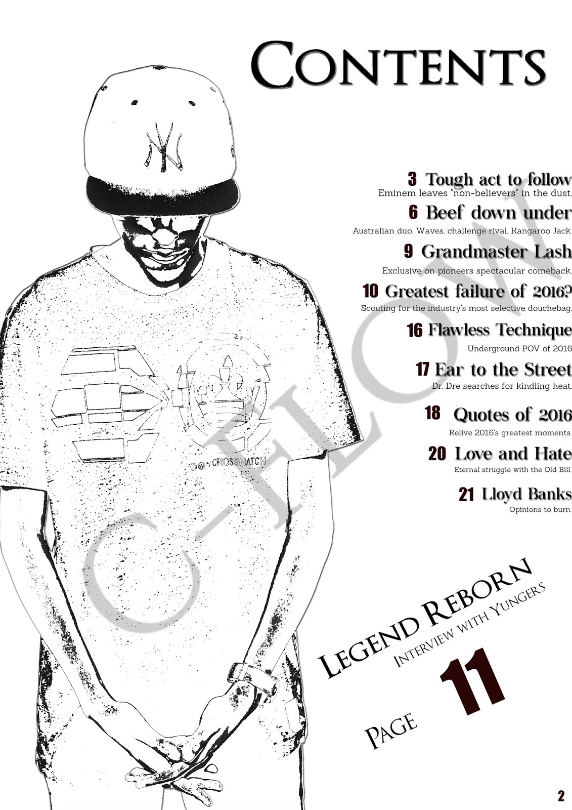
The contents page follows the house style of white, black and red white keeping the previous fonts. The page has a number of sub-heading articles, and a sentence of information after. This is a convention of retail music magazines, which entices the audience to read on. The designated numbers of each sub-heading have seemingly sporadic increases but this is to account for advertisements and miscellaneous articles. The main article was given the larger text and number sizes which other magazines also feature. The double page spread numbers correlate to the contents page, therefore showing the reliability of the information to you.
How does your media product represent particular social groups?
My magazines show the rap genre can be split into multiple subcultures. It does this by straying away from typical conventions and showing the more sophisticated, artistic side of rap. It shows it goes beyond violence, drugs and sex to show class and stature. The representation of a minority artist depicts the group as empowering and gives the Asian community a figure head. The magazine does not features very little of women, and when it does, the article detests the way they are portrayed. This contrasts the way other magazines portray them, in a purely sexual light. The magazine does not dip into race relations which sets it apart from others. Magazines like The Source gained fame for covering the black rights movement, featuring groups like NWA (Ni**as with attitude) and Tupac. This gave the black community a very anti-police vibe which enforced the stereotype of black people being violent and unlawful.
What kind of media institution might distribute your media product and why?
I believe Townsquare Media would distribute mine, due to the fact they push all genres of magazines including rap, as seen from the magazine; The Source. Additionally, Bauer Media publish many magazines and they do not own a rap-genre magazine. This would give them a chance to appeal to a larger audience.
Who would be the audience for your media product?
I have targeted ages 16-30, primarily males due to the fact that this group is the rap genre’s largest group of buyers. As seen from the questionnaire, this band is the larger group of consumers than any other. It can also appeal to females, should they possess an interest in the rap genre.
How did you attract/address your audience?
I used conventional aspects to welcome rap fans, but also went against it to make it appeal to a larger audience who demanded a more formal approach to rap. I included simple language and attractive images due to the fact that the magazine XXL has a subscriber base that is 46% illiterate. Also, to appeal to the younger generation, the Web 2.0 links were implemented so they could access the magazine on their phone. I also featured famous artists so people would view it if a person of interest was present.
What have you learnt about technologies from the process of constructing this
product?
When
constructing my magazine I have learnt about how use Photoshop to an advanced
level. This includes using the Gaussian blur functions to make sure my
photographs are the perfect blend. By using the blending options to make two
layers work together. The use of the magic wand tool, as primitive as it may
be, allowed me to take the image from the original and then place it into my
background. Lastly the drop shadows and inner shadows to add depth and make the
most of the space on the pages. In addition, I have learnt how to maximise the
effect of opacities and using the burn tool in order to get the image as dark
as the background. I have also learnt about how to use the DSLR cameras and how
to use lighting and backdrops to ensure the image professional as possible.
Looking
back at your preliminary task, what do you feel you have learnt in the
progression from it to the full product?
I
believe I have learnt how to research needed material more efficiently, while
also being able to use Photoshop skills with greater precision. I can use more
functions than previous times and have learnt conventions of magazines.
Additionally, I have learnt more about the media in general and how the public
eye is skewed towards whatever the oligopoly demands. Finally, I understand how
to meet deadlines, persevere against setbacks, and act on feedback. This and
others have been shown from my preliminary task to my final.


Wednesday, 22 March 2017
Contents page analysis
Contents page analysis
 This contents page traditionally utilises the rule of three, which does not challenge the general conventions for a rap magazine. The colour red, signifies immediacy and draws the reader’s attention to it. When in contrast to the white background, this effect is enhanced even greater. The black have connotations of the rap genre, which help associate the magazine’s house style to the genre. The black the artist, 50 cent, is wearing, succeeds in its purpose to pull readers view to the full-length shot of him. He is the only image on the page which separates him from the text. This pays homage to the high-profile rapper and gives the impression that he has previously unknown news to reveal. The white background completes the page with a certain degree of simplicity, therefore not subtracting any focus from the featured star or articles. Finally, the half-black and half-white text of the rapper, “50 cent” adds to the effect of drawing eyes to the bold page number.
The mast head for the feature page serves the purpose to inform the reader of the pages contents. The subheadings completed in bold allow the audience to get a little bit of information on the page, before receiving a little more below it. This was implemented due to the fact that it makes finding the page the viewer are searching for more convenient. This makes their experience with the magazine better and entices them to subscribe. The magazines logo is present in order to fill blank space and also assimilate the house style to their brand.
The layout and content of the feature page is dull and mundane. I believe this to be a waste of potential, due to the fact that some viewers may not endear to purchase another issue due to this problem.
Finally, the artist is facing the text on the right and looking back at the camera. This sends attention to the text but also gives of his signature expression of arrogance. I believe the image acts as direct address which aids the magazine in including the audience, as if 50 cent is looking at the reader. This may make him/her read on and therefore the image serves its purpose.

This is a Vibe magazines contents page, and is easily recognizable to fans familiar with this magazine as the background has a large, grey V which is symbolic of Vibe magazine and relates to the magazines house style and the magazine is iconic for their use of the large V.
This magazine follows a simple colours scheme as the only colours are found on the image/background; black, white and grey. This black and white style, along with the style of clothing on the image of the artist, Kanye present the magazine as sophisticated, mature and perhaps containing content appealing to adults. This is further shown by the seductive and promiscuous nature of the image as it is implied a woman is clinging to Kanye to in a way that is sexual as shown by her hand gripping onto a red heart placed on Kanye’s chest. Connotations of the colour red in this context are lust and aggression. Simultaneously, Kanye is shown to possess a stern and masculine gaze into the camera, creating an appealing and eye catching image as the readers feel as though the magazine is communicating a message directly for them.
The magazine could have been presented in this mature, sophisticated and promiscuous way to appeal to adults or perhaps late-teens as “sex sells” and this magazine hints towards a lot of sexuality.
7) Front cover analysis (Representation and Stereotypes)


The low shot of the rapper Ice Cube gives him a sense of
greater authority than the reader. It makes him seem like a larger threat. The
discerning impression breaks the convention of angry black rappers; instead he
is calm and collect. Emphasise of the letters 'KKK' in misspelt America not
only draws attention to the magazine, but also creates a direct contrast
between the two. It depicts a conflict with America hanging in the balance,
signified by the flag in the background. This only makes him seem even mellower
due to the overwhelming stakes. This magazine contradicts the stereotype of the
rap community. The artist looks directly into the camera which creates direct
address, which attempts to establish a link between him and the reader. The
cover features no plugs which also challenged the conventions of a rap
magazine.
Subscribe to:
Posts (Atom)

-
 The Dark Knight The genre falls under the action category. The sparks and flames depicted in the poster further supports ...
 -
Do you think companies such as News Corporation are good for the media market place or do they mean that the products we are offered do not...
-
Three waves of Feminism Timeline First wave: 1830's to 1900's The political agendas regarding sexual, reproductive and econom...